Project 4: Accountancy Leadership Academy

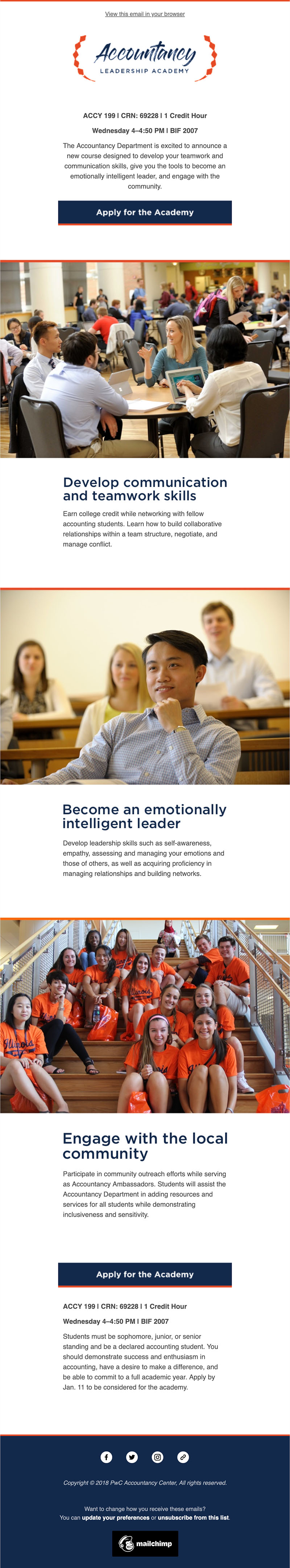
Illinois has one of the best accountancy programs in the country, and the Accountancy Leadership Academy is a program to underclassmen in accounting gain leadership experience. The advisors asked me to create a flyer; however, I took a step back and asked them what their goals were. According to Grant-Davie, “rhetors create rather than discover rhetorical situations,” and I found this idea to be very relevant to the project (265). This class challenged me to think of writing as more than the advisor’s modal preference of simply alphabetic text. The first project combined text and visual design, so I created a logo, flyer, and visual email. The second project used audio, but unfortunately, I could not find a meaningful way to use audio. The third project used video, so I created short animations for social media and TV screens.

After talking with the accounting advisors, I created three goals for this project: to educate students, to get students to apply, and ultimately, to create a better student experience. The primary audience for this project is freshmen and sophomores who are majoring in accounting. This work could be re-created with a target audience of faculty or prospective students; however, the most exigent goal is to recruit current accounting underclassmen. My process for this project included choosing among an abundance of rhetorical, material, and technological techniques. One of our first readings, and a main theme throughout the class, said: “We need to think with words, of course; yet we also need to begin thinking like artists, web designers, recording engineers, photographers, and filmmakers” (Hicks 18). To accomplish my goal, I tried to think with words, but also as a web designer, photographer, and filmmaker.

The first step in my process was to write the copy, so I interviewed faculty. I turned their sparse and disorganized thoughts into simple, clear copy. I identified the three biggest selling points, then used “you” instead of “me” terminology when writing the copy. People only want to hear about themselves, so I clearly phrased my copy so the audience clearly saw how they would benefit by applying. I made the class seem prestigious by calling it an “academy” instead of a “class” or “course.” Even though English is pretty standardized, there can be a ton of variation. I followed AP style — one of the most respected copy style guides for public affairs and news — because the University does not have a style guide of its own. However, I hate a few AP rules and ignored them: I used the serial comma, I used AM and PM instead of a.m. and p.m., and I spelled advisors with an “o” instead of an “e.” Audiences have short attention spans, so I kept the copy as short as possible. In class, I showed my peers the copy and asked them whether they understood the academy. They misunderstood a few things, and this feedback was helpful in telling me I needed to be clearer and add more information.

After finalizing the copy, I moved onto the visual design. Many associate rhetorical choices with only with alphabetic writing, but these choices are prevalent in visual writing as well. I wanted this academy to feel professional and educational, yet also modern and approachable.

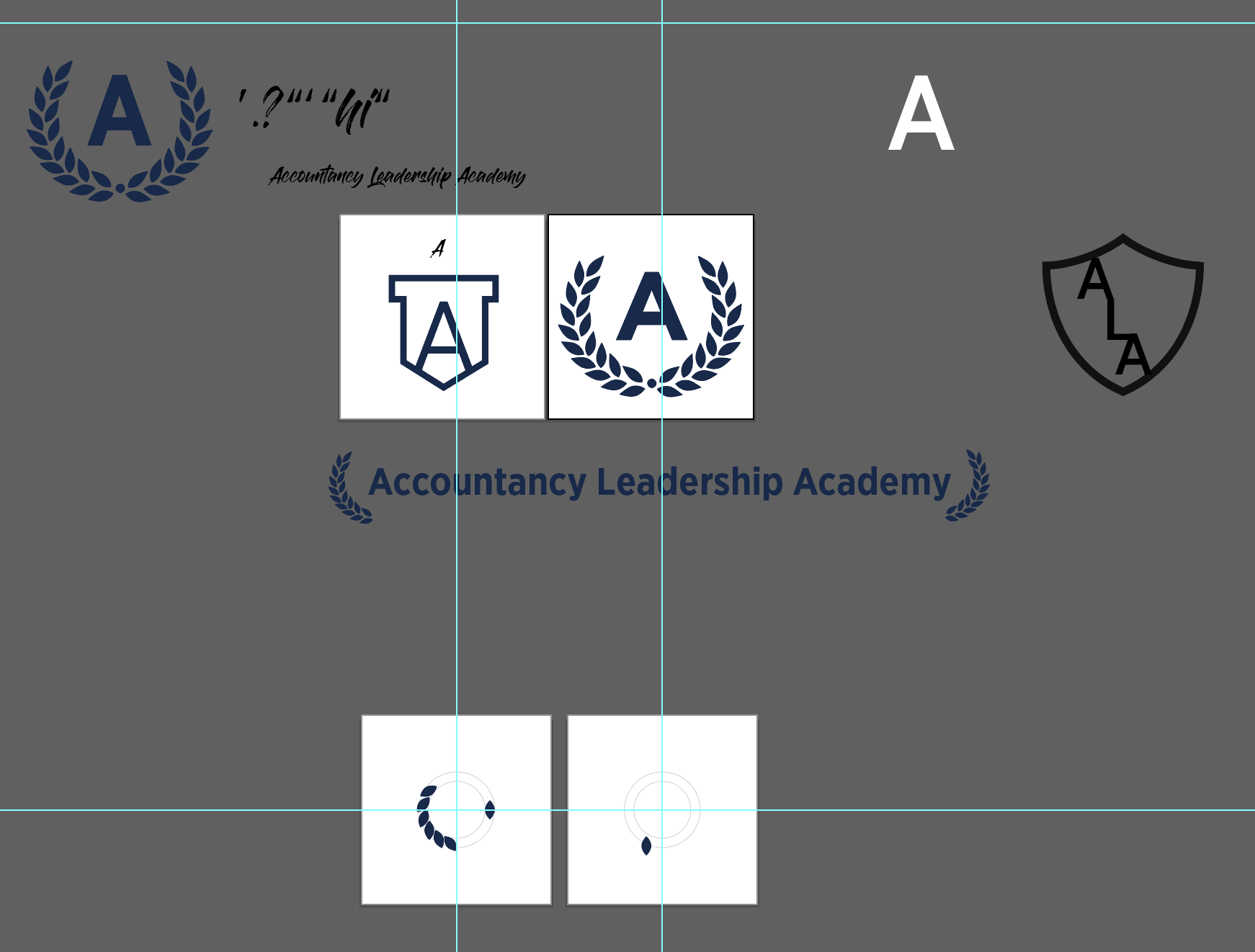
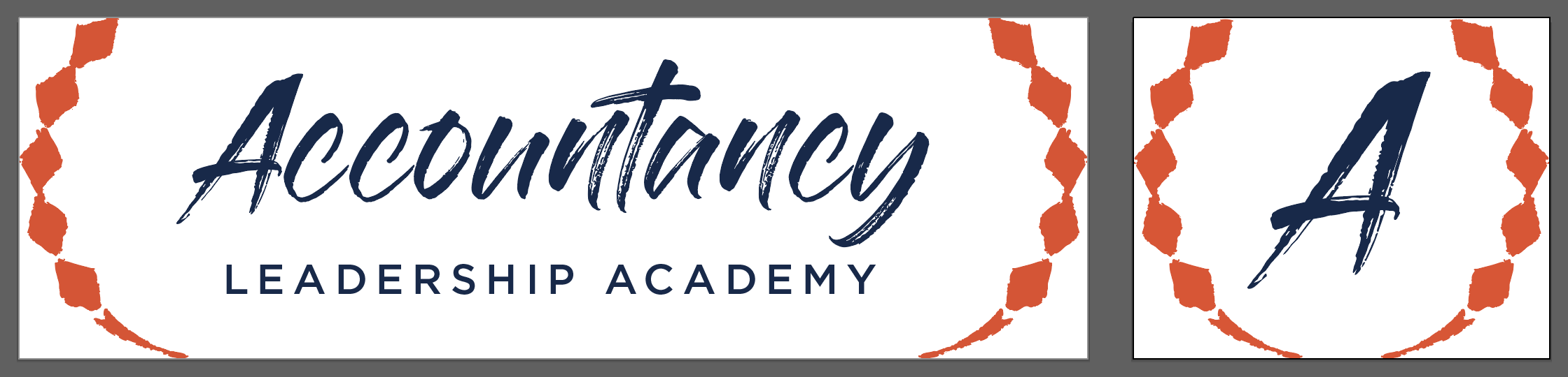
First, I tackled was the logo. I experimented with shields to symbolize strength and a laurel wreath to symbolize academia, and I ultimately chose a laurel wreath. The University uses Gotham (a sans-serif) and Roboto Slab (a slab serif), Gies Business uses Source Serif (a sans-serif), and the Accountancy uses Gloss & Bloom (a script). I branded the academy with Gloss & Bloom for the word “Accountancy” since it’s modern and best with only a few characters, then used Gotham for “Leadership Academy” since it’s minimalist and strong. Logos must be legible at all sizes, so I also created a condensed logo with only the laurel wreath and the letter “A.”

I chose a variety of technologies when creating the logo. First, I created this on paper and pencil. I completely agree with Ball’s claim that sketches are the best way to start, as it is easy to quickly iterate and incorporate feedback (185). If I start on the computer, I get too distracted by small details like color and size. Next, I created a detailed design in Adobe Illustrator. The laurel wreath looked too exact, especially next to the seemingly hand-written “Accountancy,” so I recreated it with my iPad to make it look less exact. I animated the condensed version using Adobe After Effects but did not end up using it anywhere.

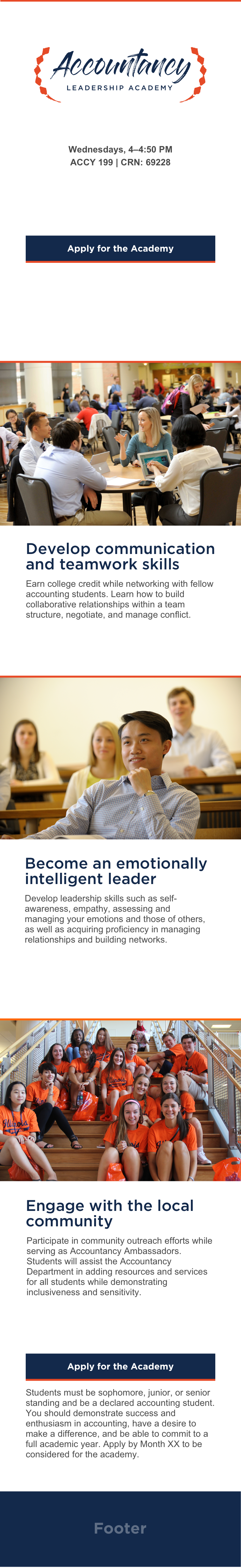
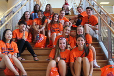
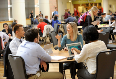
When choosing imagery, I was thankful to have Gies Business resources. I did not take my own photos, edit them, and get legal releases. There is no reason to take time to do this when professional and free alternatives are easily accessible. I included posed and unposed shots, professional and casual shots, and ethnicities.

To compile the copy, logo, and imagery, I designed an email in Sketch, a UI/UX design app. Combining these parts is complicated, and Wysocki encourages us to identify the visual elements, establish a relationship between the elements, and consider how this connects to the audience (13). When combined, the logo, copy, and visual design create an entirely new meaning. People code emails with the same HTML, CSS, and Javascript as they do for the web, but unfortunately, email clients’ support for modern code is stuck in the 1990s. After designing the email, I had to test it in a couple clients to make sure the code I used was simple enough to properly and consistently display.

Click here to view the full, interactive email.

Creating the flyer in Adobe InDesign was easy because it is basically a reformatted version of the email. The audience’s eye follows a clear path: the logo, the three headlines, the call-to-action, then maybe the descriptions. I printed this and taped it to whiteboards in BIF and Wohlers.

Click to view the PDF.

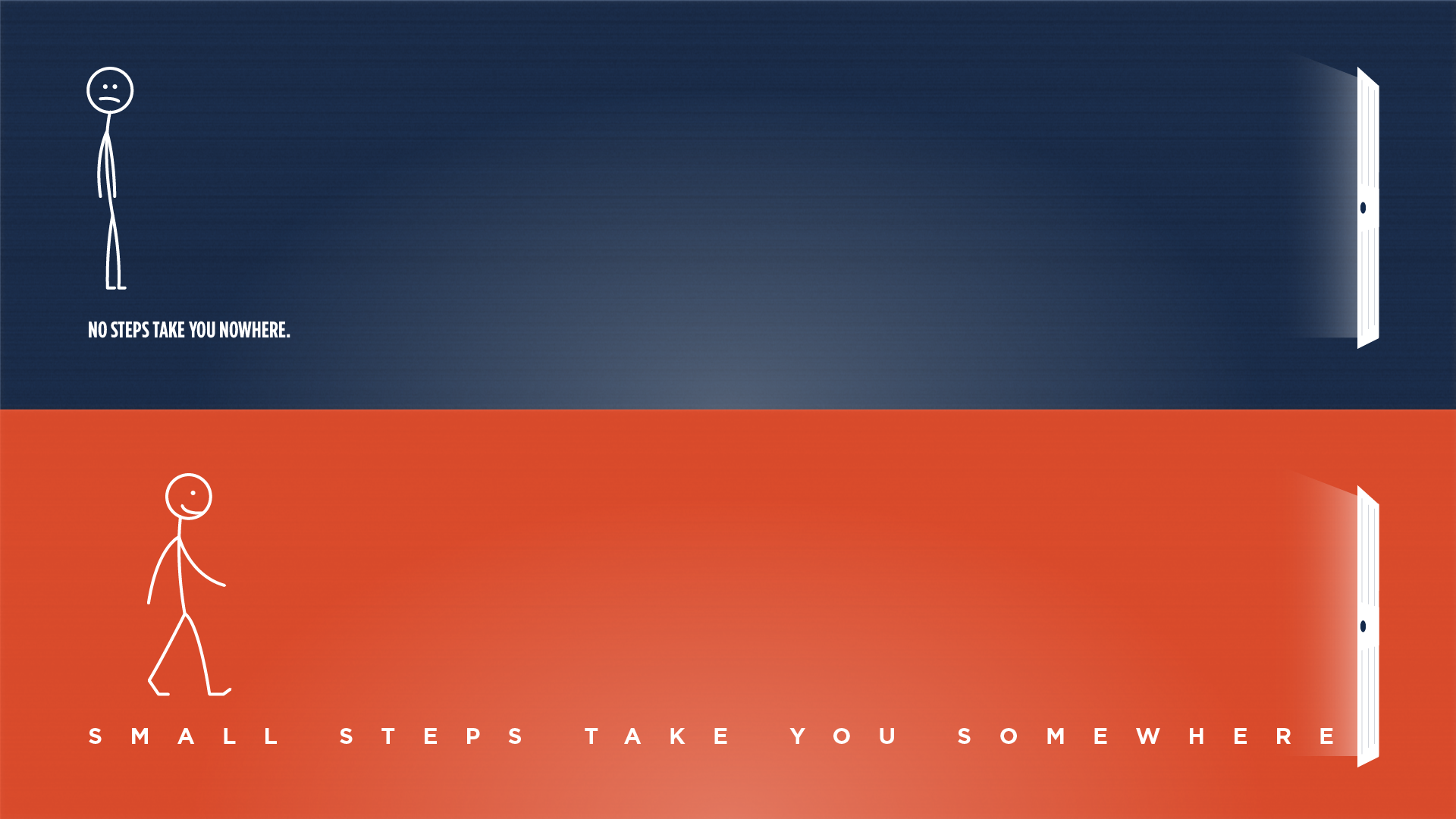
Next, I created a social media post. On social media, video is the best option for engagement. People engage with video much more than they do photo or alphabetic text. Additionally, Facebook’s (and therefore Instagram’s) algorithm displays video more frequently than it does still image or alphabetic text. The video animation suggests the audience swipe to see the same three main selling points.

The audience initially sees this video, then can swipe to see the next three images. @GiesAccyTrack will share this post sometime near the end of break.

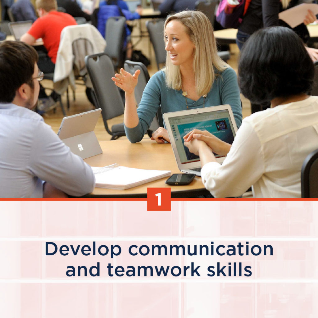
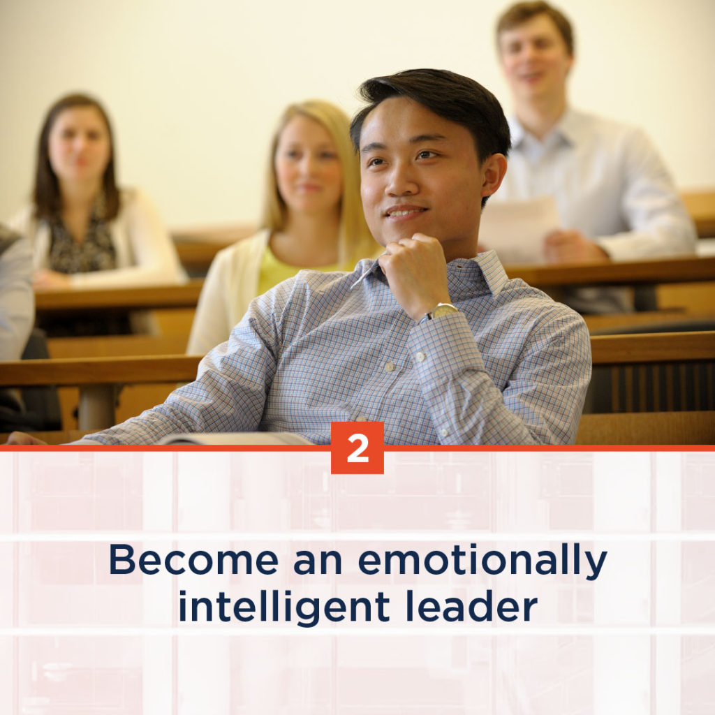
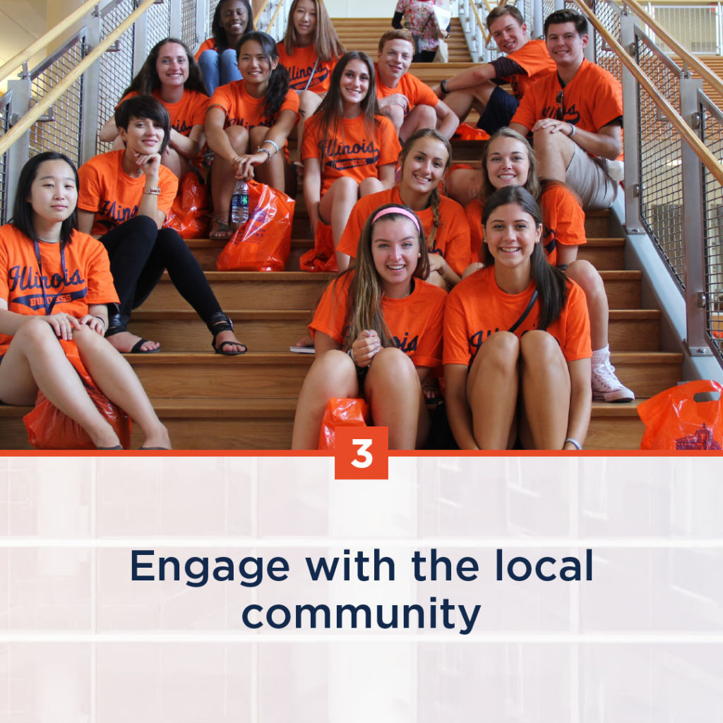
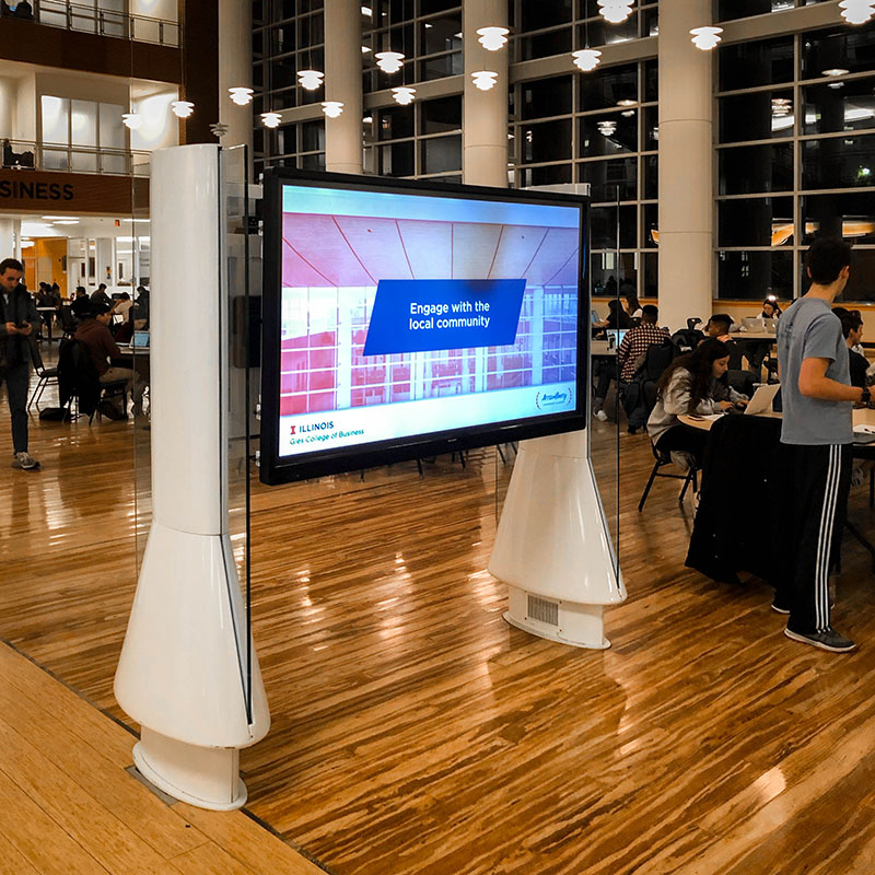
The last thing I created was the video. The Business Instructional Facility has four huge screens in its atrium, and it is one of the best ways to spread a message to Gies students. I have never seen a video on the screen, but this class has encouraged me to use all the affordances given to me by this technology. The video includes the main three points, the call to action, and additional details. I intentionally omitted a lot of information. Ball encouraged us to pay attention to traffic patterns when designing for physical spaces (175). People look at the screens from far away, and they are typically quickly walking past them. By showing small tidbits of information, I was able to keep the audience’s attention and get across all necessary information. To create this video, I combined microcopy with graphic elements in Adobe After Effects.

This video is currently live in the BIF atrium.

We consume information in many more ways than just alphabetic text, and I feel fortunate to have the opportunity to learn about this in an academic setting.

Final Project Reflection

For this project, I’m trying to include writing across many modes: photo, video, graphic design, and alphabetic text.

In class, Allysa, Carly, and I discussed each part of my project, from logo design and typography to composition and color. I have been working on this for awhile, and I’m still working on the email portion. I have to finish writing copy, finish the layout, then code it in HTML and CSS for email (and email client compatibility is stuck in 1990, so you can’t use full HTML or CSS).

Allysa and Carly discussed a few visions they had for the email. The hardest thing with an email is getting people to open it and engage with it, so the subject line and top needs to be eye-catching.

12. Let’s get moving!

Motion is at the core of capturing the attention of and connecting with an audience. This has been a popular technique throughout a lot of cinema’s history.

“We know when we go to the cinema now, the camera is never static. It’s always on the move. It’s always on a steadicam; it’s always on tracks; it’s always flying.”

Mike Gunton, Executive Producer, Planet Earth II

In early cinema, cameras weighed several hundred pounds which could barely be moved. Several decades ago, lightweight film cameras enabled this movement. When the cameras became digital, motion became very easy for a few reasons.

  1. Memory: When film moves too much, it can easily be destroyed. Hard drives — especially solid state memory — can move as much as needed without any consequences.
  2. Stabilization: Traditional film cameras were attached to steadicams, which are contraptions with weights to counteract movements that videographers wear to stabilize video. In the last decade, have become popular, smaller, and more affordable. (Similar technology is even embedded in smartphone cameras!) Gimbals include gyroscopes, which are sensors that measure motion on three axis: x, y, and z. In real time, motors move the lens to counteract this motion.

We can see this technological change exemplified in the Planet Earth films from 2006 and 2016. In 2006, cameras were on tripods, steadicams, and helicopters. Tripods limit any movement, steadicams limit agility, and helicopters limit intimacy. With gimbals and drones, the videographers of Planet Earth II were able to get a huge range of motion.

Like we learned in class, we can see that drones can to create long distance shots to establish context, while gimbals can create closeups and point of view shots to establish intimacy.

Even though we don’t have the same technology from Planet Earth available to us for this project, we can still take away many of the lessons. For example, we can quickly move the camera to show intense action, slowly move the camera to create suspense, and keep the camera steady to help the audience fixate on one subject.

9. This post is copyrighted

For this blog post, I’m drawing upon what I already know about intellectual property. Most of what I know comes from a corporate setting, both from my internship at State Farm and from my dad’s job as an intellectual property attorney. Because I won’t be in class on Thursday, I’ll have a conversation with Sohum about copyright based on his notes!

Copyright

A copyright gives exclusive ownership to whoever creates the piece. It sounds simple enough, but there’s lost of gray area. Here’s what I know:

  • Copyright is automatic. You don’t need to put a disclaimer at the bottom of your website or piece.
  • It needs to be original. Thresholds of originality vary across jurisdictions and aren’t always clear.
  • Copyright protects the way you expressed an idea, not the idea itself. This is frequently the deciding factor in copyright lawsuits; to decide, judges ignore the actual idea of the piece and only focus on way the piece was created. For example, you can’t copyright a recipe which is a list of ingredients; instead, you could copyright the photos and story in a cookbook. This is why Coca-Cola hasn’t released its recipe — it protects the recipe with a trade secret.
  • Copyright is owned by the person who creates it. When writing on behalf of another organization (for example, a company or educational institution), the copyright might automatically be owned by the organization. I’m not sure whether I own this blog post or whether the University of Illinois Board of Trustees does… oh well ¯_(ツ)_/¯ Also, my use of the word “person” is intentional. If a monkey takes a selfie, the camera owner doesn’t own the copyright.

Copyright owners can easily allow others to use their content with Creative Commons. It’s very widely used, and there are many options depending on how you want people to use it.

Fair use

Fair use covers how you can use someone else’s copyrighted work without breaking the law. It allows people to talk about copyrighted work and educators to teach. There are a few things that decide whether your use is fair:

  1. Whether it’s actually copyrighted. If it can’t be copyrighted, you don’t need to worry about fair use (see previous section). Also, you have to be very very careful that the content you’re using is actually owned by the person who posted it. Just because it shows up on Google Images or Wikipedia as “labeled for reuse” doesn’t mean you can actually use it. Images, videos, and audio are frequently mislabeled, and this mislabel won’t protect you if you get sued by the actual copyright owner.
  2. What you’re using it for. If you’re using it for commercial use, rules are a lot stricter (for example, Marvel threatened to sue State Farm for using #Avengers in a Tweet). If you’re using it for educational use, you’re probably fine. If you’re an individual, you might get in trouble, but the owner will probably just ask you nicely to take it down.
  3. How much of the work you’re using. The less you use, the more likely it is to be fair use. Rules area always changing and vary across modes of communication and jurisdictions.
  4. How it affects the copyright owner. If your use has little impact, it’s fair use, but if the owner could’ve profited from or if they lost money from your use, it’s not fair use. Because large corporations are at higher risk of getting sued for a lot of money, they usually discourage use of all copyrighted work, even if it could possibly be fair use.

Copyright litigation is expensive, and owners will likely only sue if they believe they can profit from a win. Some law firms exist solely to profit from finding people not fairly using content. Earlier this semester, the European Union began legislation that could “ban memes,” or more realistically, change the way the internet works.

Citing sources

Similar to how fair use varies based on its use, so do expectations regarding citing sources. In academia, citing sources is usually encouraged. It helps validate accuracy of information, and sometimes, copyright owners only allow their content to be used if it’s cited.

Corporations usually discourage citing sources. Because copyright and fair use doesn’t inherently require you to cite your source, there’s no reason to. In addition, it basically advertises that you’re using someone else’s content and encourages litigation.


Copyright is a very complicated subject. Whether something can be copyrighted is unclear, and fair use varies across who uses it and how you use it. Additionally, it’s a small part of intellectual property as a whole, which includes trademarks, patents, trade secrets, and other things.

7. Going to class

The readings have taught me a lot about the history of sound in media. Because of the internet, easier access to technology, and audiences’ changing expectations for media, the rhetoric role audio plays is changing rapidly. Sound is no longer limited to radio or movies; it can stand independently (like a Podcast) or go along with other clips (like Snapchat), and basically anyone can engineer sound at at any time.

Ben summed up the advantage that sound plays pretty well:

“Sound helps to intensify the emotions and sharpen the memory to remember certain things. Visual media, on the other hand, takes only the effort that the audience gives it. Therefore, there is a bigger possibility that the material will go right over the onlooker’s head.”

Similar to how you can upload photos to Google Maps to show the public what an area looks like, social soundscaping is sharing audio clips to share what a certain location sounds like.

For my audio practice, I created a soundscape of a University of Illinois student’s walk to class. This soundscape couldn’t be an actual walk to class, as the sounds appear too close to each other. For the listener’s sake, I created an abridged walk to class.

Practice Audio Clip: Walking to Class

A student gets off the bus at Gregory at Library, then walks to Sixth and Gregory near the Business Instructional Facility. They wait for the walk sign to turn on, then cross Sixth street. The stop light has audio indicators to allow people with difficulty to know when they can cross, so the soundscape includes “walk sign is on to cross Sixth Street.” Similarly, the student waits to cross Gregory. To let the audience know there is heavy traffic on campus, I included a car horn and a signal from near Grainger: “Cross street with caution; vehicles may not stop.” Lastly, the audience can hear the door opening and a crowd chattering, indicating the student made it to class in the Business Instructional Facility.

I edited this with Adobe Audition. It has way more features than I know how to use, but it’s included in the bundle of Creative Cloud software I do use heavily. I created multiple audio tracks so I could layer sounds on top of each other and easily control audio volume. To create a sense of aural continuity between clips, I panned each clip in and out, ensuring there was never white noise between clips.

One thing I definitely need to improve on for the final project is audio quality. There was a ton of background noise, especially on the street crossing signals. Background noise is a natural part of life, but it distracts from the main story.

6. In a Perfect World

When I was creating my visual project, I wanted the audience to feel something. I wanted them to think about their life currently, and their life as it could be. With the addition of some music, I could’ve helped transport the audience out of their present surroundings and into an introspective setting.

The song I hear when thinking about this project — and the song I’m thinking about as I write this blog post — is “In a Perfect World” by The Sam Chase.

These are two of my favorite lines:

“If you keep your options open / there are places you will go”

“Let me tell you mister / you should always talk to strangers / because you never really know the brilliant things that you might hear”

This song has very deep meanings, including life after death, but it is also very easy to apply to everything that is currently happening in many University of Illinois students’ lives. I take on as many opportunities as I can and rarely say no, since “if you keep your options open, there are places you will go.”

My listening habits are very habitual. When I wake up in the morning, I listen to NPR News Now, Motley Fool Money, Up First with NPR, USA Today 5 Things, and a couple other news podcasts on my Google Home (depending on how long it takes me to get ready).

I take advantage of my time between classes and work by listening to music while walking. When I drive by myself, I listen to some longform podcasts, like Serial, How I Built This, and Getting Curious with Jonathan Van Ness. Occasionally, I listen to self-development audiobooks instead of reading them.

Audio is a way for me to escape reality and draw myself back into it.


Everyone started writing “traditionally” when they were 5 or 6, and everyone started writing “non-traditionally” even earlier. In the first unit, I learned how to link traditional writing with non-traditional visual writing in an academic setting, and I learned how to analyze the visual aspects of writing.

I rarely have to write long essays for class anymore. I know a 1,000 word rationale isn’t that long, but it required me to plan. These are skills I learned in high school but abandoned in college, and this project required me apply what I’ve learned in the past few years to what I learned in high school.

I took a second look at the readings, identified concepts that relate to my project, outlined the big ideas I wanted to explain, and made sure I covered the assignment’s requirements. Once I had done that, all I had to do was fill in the missing spots and make sure the rationale flowed well. I attribute the lectures, readings, and big assignment to my shift in writing process.

I used Adobe Creative Cloud software for this project. It’s the industry leading software for creatives and can accomplish almost everything an individual would want to do. If a student really wants to invest in their future by learning the software and paying the upfront monetary cost, I definitely recommend it.